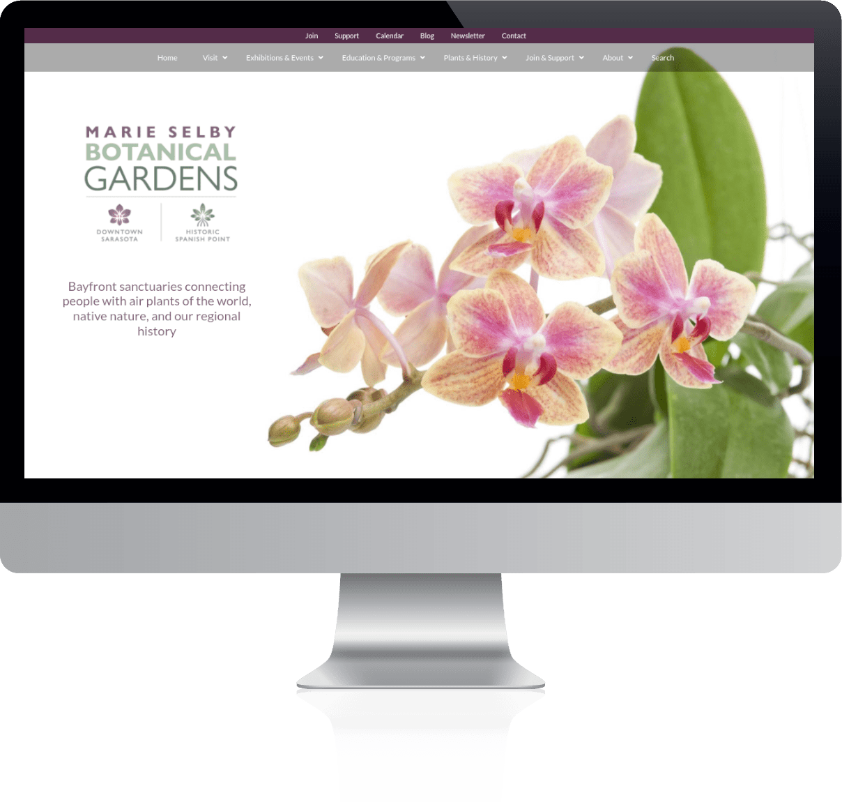
Marie Selby Botanical Gardens (MSBG) is a cornerstone attraction for the greater Sarasota, Florida area. With 45 acres of bay front gardens, Selby boasts:
The Downtown Campus on Sarasota Bay is the only botanical garden in the world dedicated to the display and study of epiphytic orchids, bromeliads, gesneriads and ferns, and other tropical plants.
When they approached Creative Sarasota about spearheading their website redesign, we jumped at the chance to work on such an important project. Not only did we anticipate a splendid challenge working on such a robust website, but we were honored to work with a group dedicated to preserving and documenting our natural environment for generations to come.
Directive, Objectives, & Challenges
The objectives and challenges of this project ran the gamut from standard to outside the box. At the core of almost every decision, though, was one directive: clarify and simplify the user experience. Whether addressing the website visitor or the website administrator, clarity and simplicity was the launching point.
The second major directive was scalability. We noticed that the previous website architecture made it difficult for the MSBG management team to accommodate growth. Thus, one of our main focuses was to build the site with the anticipation of expansion. We focused on two things. First was a balance between scalable and easy(ish)-to-use navigation management features. The second was building certain sections in advance so they were ready when the time came to develop the content.
These objectives were challenging for a few specific reasons.
Size, Sitemap, and Disrepair.
Company Size
The first issue was the size of the company. MSBG was already a good sized non-profit. But in May, it adopted the Historic Spanish Point (HSP). This gave them a new campus to incorporate into a single website with a new brand. With that addition, there became 3 brands we had to make distinct while still feeling like a cohesive, single unit. Those brands are The Downtown Sarasota campus (the original Selby Gardens), the Historic Spanish Point campus, and the general Marie Selby Botanical Gardens parent brand. We needed to make sure visitors could easily identify which pages and navigation belonged to which brand. And we had to do that without making the website feel schizophrenic.
A State of Disrepair
The second issue is the size and state of the website. There are hundreds of pages and posts. They exist in multiple levels of categories and parent/child page relationships. This was all in a custom WordPress theme that was built nearly a decade ago. People had come and gone in that time. Thus, information was difficult to manage and navigation was incongruent.
The custom theme and plugins also proved a little problematic. The previous architects had built some wonderful custom functions. They used many plugins to build out a lot of features. Unfortunately, over time much of this fell into disrepair. Plugins that were crucial to the existing design had been abandoned by the creator. Thus, creating security risks.
Content Volume
Existing versus anticipated content was also an issue. Some sections had quite a few pages while others had exactly one page but were exptected to grow. Thus, we felt it prudent to put navigation and page sections in place so they were ready for content when the time came. But, what do you do with space when there’s no content?
Complex Navigation
By far, one of the biggest challenges of this project was navigation. The navigation experience is paramount to an effective website. Especially when it is a large and complex website. Here are a few of the big issues we had to contend with.
- Large site with a final page count of over 130 pages and hundreds of posts.
- Multiple campuses requiring separate representation.
- 3 brands requiring individual distinction while maintaining a cohesive relationship.
- Multiple company departments with vastly different content volume.
- Multi-level parent/child page relationships.
- Section-specific sidebar navigation
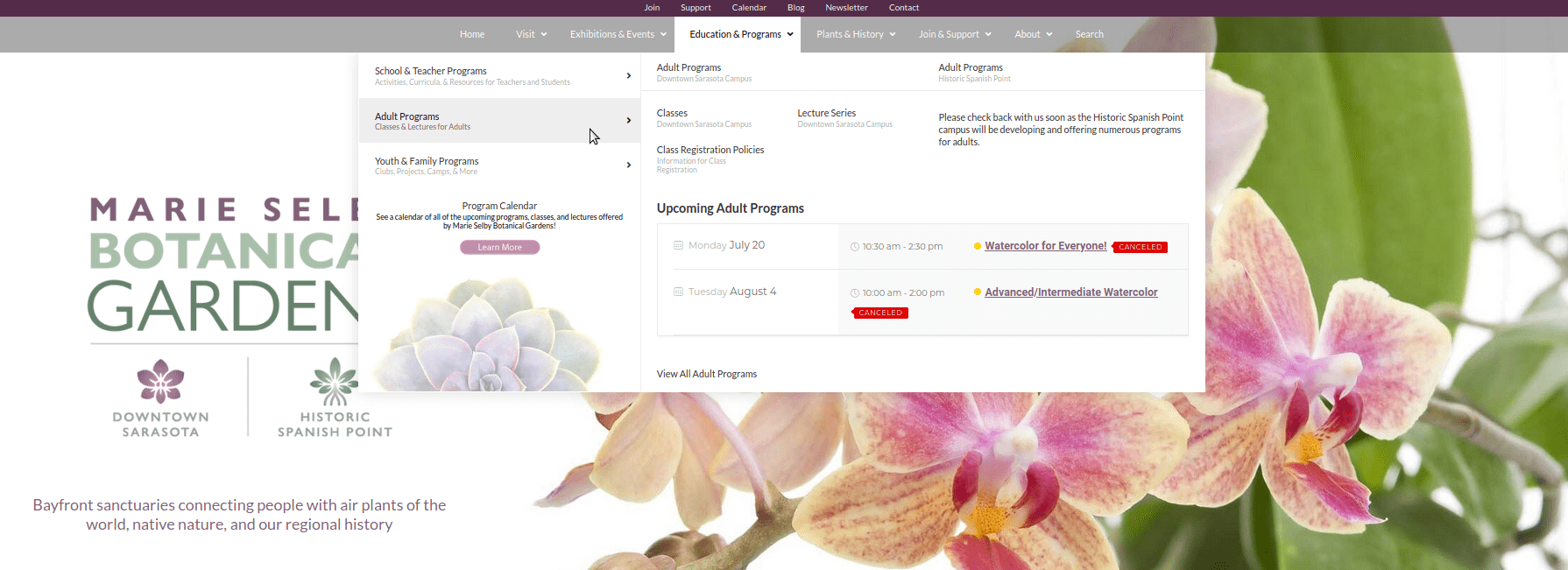
To accommodate this, we opted for a mega menu. The menu was organized into six primary levels. Each of those descend to a second, vertical tabbed level. Each of those break further down into third and fourth levels of pages.
Content Volume… Again
As previously mentioned, there was some disparity between the amount of content for the different sections or departments. This resulted in some of the tabbed menu sections having many links, while others had only one or two. We employed a few different tactics to fill that empty space and make the navigation look more evenly populated.
In some areas we created Featured Content blocks so the Selby team could highlight pages at will. We also filled out space by displaying automatically generated upcoming calendar events. Finally, in some areas we simply put copy that we thought would be useful to the visitor. Content like definitions, addresses, or hours was used.
Section Clarity
The three different brands posed a unique challenge. Some pages and sections were specific to one of the two campuses while some related to the general parent brand. It was important to mitigate the potential confusion for visitors. We needed it to be as clear as possible if a link, page, event, or exhibition was campus specific or general.
To address this we provided a simple way for the MSBG team to specify one of three background colors when a visitor mouses over a link. Purple for the Downtown Saraosta campus, green for the Historic Spanish Point campus, and gray for general pages. This way there is a strong visual cue for where the page belongs.
We also incorporated link sub-headings so the team could place clarifying copy below the link if need be.
Style and Beauty
Finally, we wanted the navigation to look good. Mega menus are a unique opportunity to do just that. Because they expand to accommodate larger navigation structures, there is invariably more room to augment the navigation experience with photography. graphics, and more color. Thus, we incorporated muted, background images of beautiful flowers and succulents relevant to the gardens.
Page and Section Identity
Large websites often need to implement a way to identify to a visitor what section or department they are viewing. With Selby, not only do they have multiple departments, they have multiple campuses and brands. We used color and sidebars to further clarify where a visitor is on the website.
The secondary navigation (very top of page) changes color depending on the section brand. For any page that is specific to the Downtown Sarasota Campus it turns purple. For Historic Spanish Point it turns green. For non-campus specific pages it turns deep blue.
We also used the header image as a means of specifying location. Each of the three brands had a header image that reflected that section.
The sidebar heading also reflects the current section in a couple of ways. First, the heading reflects the name of the top level section. The sub-heading reflects which campus or none. And finally, the background image behind the sidebar heading is the respective campus-specific logo.
Other Project Highlights
Events
Calendar
We implemented a robust calendar that accommodates all the standard and custom calendaring needs.
Custom
Sidebar Nav
Using multiple section templates, we built sidebars that display links specific to the page category. Both sidebar and main nav elements are updated simoultaneously, minimizing incongruency issues.
Homepage
Carousel
The Selby team wanted an easy and attractive way to highlight certain pages on their home page. We implelented a carousel that allows them to easily add, modify, and remove stylish carousel items.
Automated
Footer Banner
A pre-styled, rotating footer banner displays selected pages as advertising. All the Selby team has to do to change or modify the banner is select an appropriate featured image for a page, change the page excerpt, and add a specific tag. Then, the page image and excerpt copy is automatically fed in the rotation of pages displayed randomly on the footer of all pages.
High Exposure
Areas
As a very active non-profit organization, Selby has a lot of initiatives. All of which are important. We designed layouts that accommodated a large number of high exposure initiatives with out making the visual space feel cluttered.
Accessibility
Considerations
We configured software solutions that allow the website to be more easily navigated by assitive technologies.
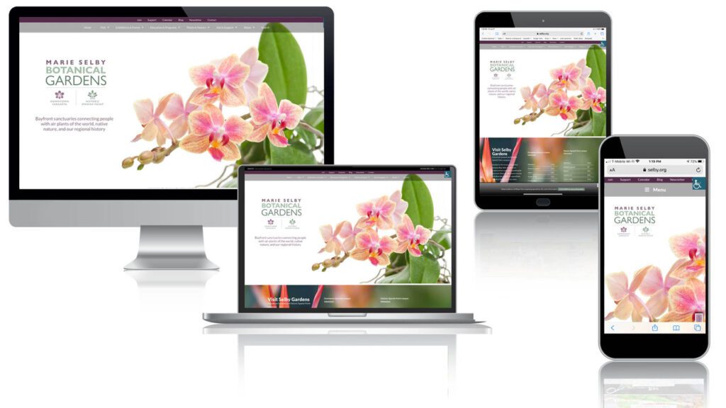
Responsive
Layout
As with all Creative Sarasota designs, we make sure the website lays out attractively and appropriately on the standard sizes for the 3 main device categories: desktop, tablet, and mobile phone.